

The Psychology of How Our Bedrooms Colors Affect Sleep
Creating a peaceful sleep environment is essential for good rest, and one of the most impactful elements of a bedroom’s ambiance is color. Different colors have been shown to influence mood, relaxation, and even sleep quality, making a color selection in a bedroom more than just a style choice. From soft blues to calming greens, certain hues can promote a restful environment, while others may have the opposite effect. We'll go over the broad strokes of how bedroom colors can affect sleep and offer suggestions for color palettes that promote relaxation and quality sleep.
Colors Impact Our Mood Which Can Then Impact Our Sleep Quality
Colors have a psychological impact that can either relax or stimulate the mind. When choosing colors for a sleep space, it’s helpful to consider how each color may influence your mood and comfort level. Generally, cooler tones (like blues and greens) have a calming effect, while warmer tones (like reds and oranges) tend to be more energizing. Neutral tones (like whites, grays, and beiges) provide balance, offering a restful backdrop that doesn’t overstimulate.
Colors that help induce a calm state are ideal for bedrooms, as they reduce stress and help the brain transition to sleep. In contrast, bright, bold colors can activate the mind, making it harder to unwind.
Blue Is the Ultimate Color of Sleep
Blue is known as one of the most calming colors and can help lower blood pressure and heart rate, both of which promote restful sleep. Soft shades of blue, such as sky blue or pastel blue, create a peaceful environment that encourages relaxation and reduces stress.
Suggested Palette: For a soothing blue color scheme, pair light blue walls with soft white or gray accents. Incorporate darker blues in bedding or decor to add depth without overpowering the space. The effect is one of tranquility, making it easier to drift off to sleep.
Green Offers Refreshing and Restful Space
Green is associated with nature, and its calming effect makes it an ideal choice for a bedroom. Shades of green evoke feelings of relaxation and freshness, helping you feel grounded and at ease. Light to medium greens, such as sage or mint, are especially effective in promoting calmness without overwhelming the senses.
Suggested Palette: A soft green paired with cream or beige accents creates a balanced and serene environment. Darker greens, such as olive, can be used for accents to add richness without overstimulation. Plants or botanical-themed decor can enhance the natural feel of the room, reinforcing the sense of relaxation that green inspires.
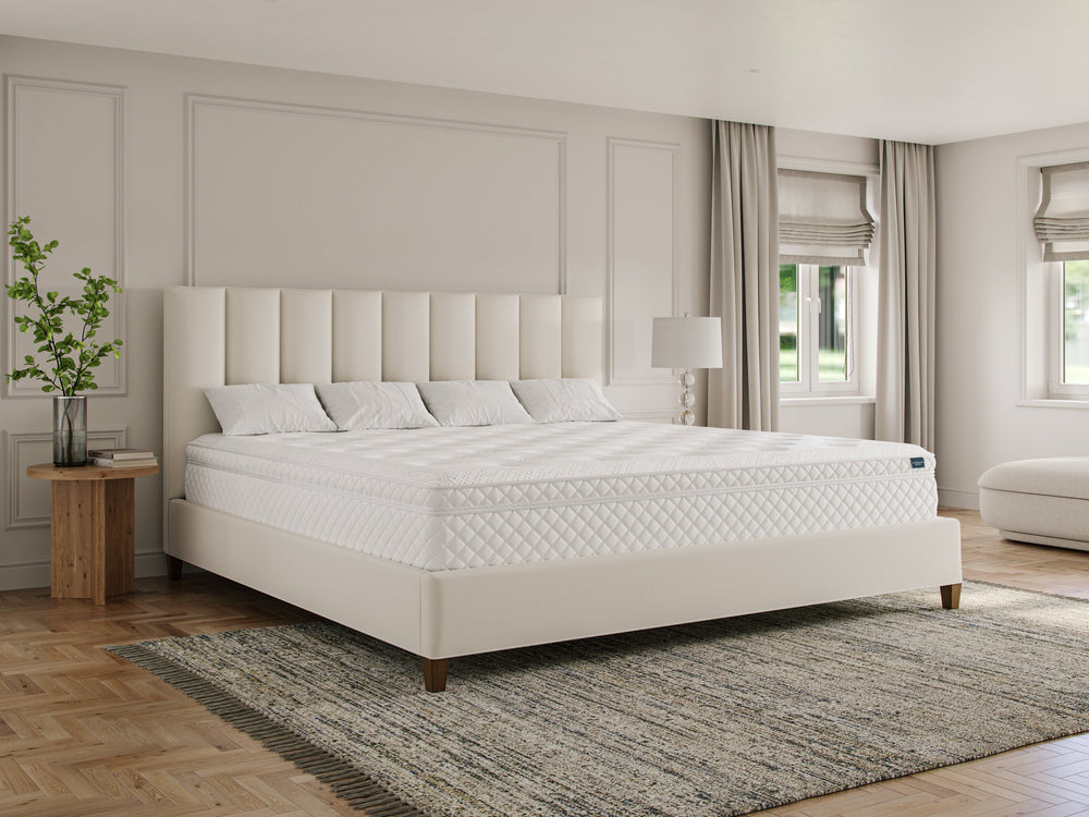
Neutral Tones are Balanced and Soothing After a Long Day
Neutral colors like beige, cream, gray, and taupe provide a restful backdrop in a bedroom. These shades don’t draw much attention, allowing the mind to relax. Neutrals work well for those who prefer a minimalist aesthetic and want to avoid bright colors that may disrupt their sleep.
Suggested Palette: For a neutral-themed bedroom, combine shades of beige, taupe, and soft gray to create a cozy, layered look. Textures can be introduced through bedding and rugs to add warmth without changing the color scheme. Neutral colors pair well with natural materials, such as wooden furniture or woven accents, to create a peaceful, organic feel.
Lavender Is Calming and Comforting Just Like the Tea
Lavender is a gentle color that combines the calm of blue with a touch of warmth from red. Its soothing hue can reduce anxiety and help the mind transition to a more restful state. Lavender works well as a wall color, especially in rooms with limited natural light, as it brings a subtle glow without being too intense.
Suggested Palette: Pair lavender with soft grays and whites for a clean, balanced look. Adding silver or muted metallic accents can enhance the calming effect while adding a touch of elegance to the room. Lavender bedding or pillows can complement the walls, creating a unified and soothing color scheme.
Soft Pink Is Gentle and Reassuring Helping You Doze Off
While bright pinks can be energizing, soft pink or blush has a calming effect that can promote relaxation. Light pink hues are associated with warmth and nurturing, creating a cozy, welcoming environment in the bedroom. This color is especially suitable for those who prefer a warm-toned room but want to avoid intense or stimulating colors.
Suggested Palette: Pair a soft pink with cream or ivory to create a gentle, dreamy atmosphere. Rose gold or copper accents add warmth without overpowering the room’s softness. Keep the pink muted to avoid overstimulation and maintain a relaxing environment.
Gray Is Elegant and Calming
Gray is a versatile, neutral color that can have a calming effect in the bedroom. Light grays provide a sense of peace and relaxation, while darker grays add sophistication without feeling too heavy. Gray is ideal for those who want a contemporary look with a serene ambiance.
Suggested Palette: Use light gray as the primary color, with darker gray or charcoal accents in bedding and decor. Adding white or silver accents helps maintain a light, airy feel. For added warmth, introduce natural wood elements or soft textures like wool or velvet to soften the overall look.
Choosing Bedroom Colors is a Combination of Psychology and Personal Taste
The colors in your bedroom have a significant impact on your mood and sleep quality. By selecting hues that encourage relaxation and calm, you can create a sleep-friendly space that promotes restful nights and a peaceful ambiance. Whether you choose a serene blue, a refreshing green, or a balanced neutral, a carefully chosen color palette can transform your bedroom into a haven for relaxation. Need to order matching bedsheets for your Wyoming King bed? We've got you covered.